








The Role Of Responsive Web Development In Modern Digital Experiences
7 Mins Read
Published on: 13 January 2026
Last Updated on: 03 September 2026

- What Is Responsive Web Development?
- Why Does Responsive Web Development Matter?
- Benefits Of Responsive Web Development:
- 1. Creates A Better User Experience:
- 2. Supports Mobile-First Web Experiences:
- 3. Supports Search Engine Accessibility:
- 4. Simplifies Website Management:
- 5. Improves Accessibility:
- Challenges of Responsive Web Development
- 1. More Complex Design Requirements:
- 2. Performance Can Suffer Without Optimization:
- 3. Cross-Browser And Device Testing:
- Best Practices For Responsive Web Development:
- 1. Start With A Mobile-First Approach:
- 2. Use Flexible Layouts:
- 3. Optimize Images And Media:
- 4. Make Navigation Easy To Use:
- 5. Test Real User Journeys:
- How To Evaluate A Responsive Website?
- The Future Of Responsive Web Development:
- Build Better Digital Experiences Across Devices:
Key Takeaways
- Responsive web development keeps your site usable and readable, no matter what device someone’s staring at. Phones, laptops, and tablets- you name it.
- Mobile-first design? Yeah, you can’t really skip it anymore. Most people are on their phones, whether they like it or not.
- Responsive sites play nicer with SEO, too. That is, search engines now think mobile-first, so if your site doesn’t, you’re already behind.
- Running one responsive site is cheaper and way less of a headache than juggling a desktop version and a mobile one. Trust me.
- Speed matters. Test across devices, or your site could feel like it’s moving through molasses.
- And the future? PWAs, AI-powered personalization, voice-based browsing- all that stuff’s already shaking things up.
A website may be viewed on a smartphone, tablet, laptop, desktop monitor, or another connected device. Each screen has different dimensions and interaction requirements.
If a website only works well at one screen size, users may have to zoom, scroll horizontally, or struggle to find important information. These problems can make even a well-designed website frustrating to use.
Responsive web development addresses this challenge by creating websites that adapt their layout and content to different screen sizes and devices.
A responsive website can improve usability, accessibility, performance, and the overall experience of interacting with a brand online. It can also simplify website management by allowing businesses to maintain a single site that serves users across different devices.
What Is Responsive Web Development?
Responsive web development is the process of building websites that adapt to the size and characteristics of the user’s screen.
Developers typically use flexible layouts, fluid grids, responsive images, CSS media queries, and other techniques to make content adjust across different viewport sizes.
For example, a three-column desktop layout might become a two-column tablet layout and a single-column mobile layout. Navigation menus, images, buttons, and other interface elements can also change position or size to remain usable.
The objective is not simply to make a website smaller on a phone. It is to ensure that the site’s content and functionality remain accessible and easy to use across devices.
Why Does Responsive Web Development Matter?

People access websites from a wide range of devices. A business therefore cannot assume that every visitor will experience its website on a large desktop screen.
A responsive approach allows businesses to design around the user’s needs rather than a single screen size.
It can also simplify website management. Instead of maintaining separate desktop and mobile versions of a website, businesses can generally serve the same site across devices while allowing the layout to adapt.
Responsive development is particularly important for websites where users need to complete actions such as:
- Reading articles
- Finding contact information
- Filling out forms
- Making purchases
- Booking appointments
- Comparing products
- Accessing account information
When these tasks are difficult on smaller screens, users may abandon the website before completing them.
Benefits Of Responsive Web Development:
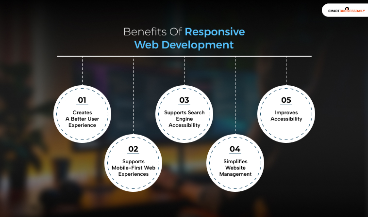
Unlike other web development approaches, a responsive design offers countless benefits for both businesses and brands. So, here are some of the major benefits of having a responsive design:
- Better User Experience: Sites feel intuitive. People get around without thinking too hard. Makes them happy, keeps them there.
- SEO Wins: Mobile-friendly layouts line up with Google’s mobile-first indexing, so your site might actually get seen.
- Cost Savings: One codebase, one site. Fewer things to break. Fewer headaches.
- Future-Proofing: New devices keep popping up. A responsive framework means you don’t have to tear everything down and start over every time something new hits the market.
1. Creates A Better User Experience:
A responsive website adjusts its layout to make content easier to read and interact with.
Text should remain readable without excessive zooming. Buttons should have enough space to tap comfortably, and navigation should remain easy to understand.
A consistent experience across devices can also help users move between devices without having to learn an entirely different interface.
2. Supports Mobile-First Web Experiences:
Designing for smaller screens first can help development teams prioritize the most important content and functions.
Mobile-first development does not mean that desktop users are ignored. Instead, teams begin with the constraints of a smaller screen and progressively enhance the experience for larger displays.
This approach can encourage simpler navigation and more focused page layouts.
3. Supports Search Engine Accessibility:
Responsive design can work well with Google’s mobile-first indexing approach because the same URL and underlying content can serve users across devices.
However, responsive design should not be treated as a direct ranking advantage. Search visibility depends on many factors, including content quality, relevance, technical accessibility, and page experience.
Businesses should therefore treat responsive design as part of a broader technical and user-experience strategy rather than an SEO shortcut.
4. Simplifies Website Management:
Maintaining separate desktop and mobile websites can create additional development and maintenance work.
A responsive site can allow a business to manage one primary website while its layout adapts to different screen sizes.
This can simplify content updates, testing, analytics, and ongoing development.
5. Improves Accessibility:
Responsive development can support accessibility when it is combined with accessible design and development practices.
For example, developers should consider:
- Readable font sizes
- Sufficient color contrast
- Keyboard navigation
- Visible focus indicators
- Accessible forms
- Appropriate touch targets
- Semantic HTML
- Screen-reader compatibility
Responsiveness alone does not make a website accessible. Accessibility needs to be considered throughout the development process.
Also Check: Top Programming Tutorials On YouTube That Actually Teach You To Code
Challenges of Responsive Web Development
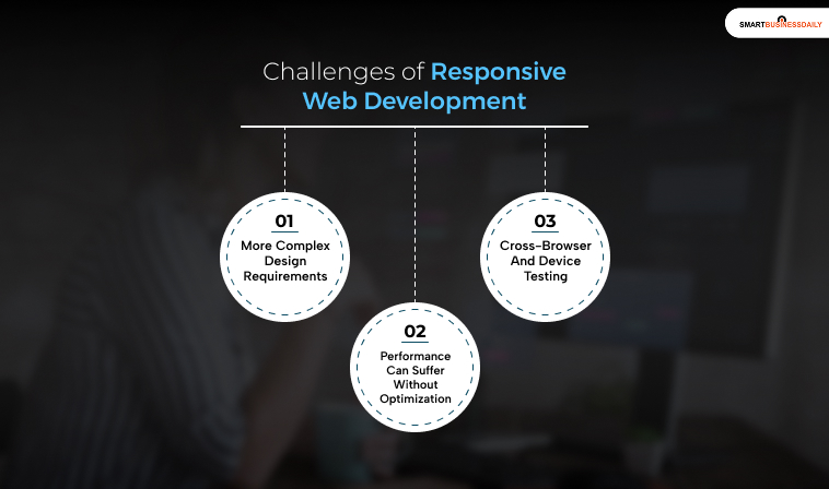
Responsive websites offer significant advantages, but creating one requires careful planning and testing.
1. More Complex Design Requirements:
A layout that works well on a large monitor may not translate directly to a smartphone.
Designers and developers need to consider how navigation, images, tables, forms, cards, and other components behave at different viewport sizes.
This requires more than simply adding a few media queries. The entire user journey should be considered across devices.
2. Performance Can Suffer Without Optimization:
A responsive layout does not automatically make a website fast.
Large images, unnecessary JavaScript, inefficient CSS, third-party scripts, and poorly optimized fonts can all affect loading performance.
Responsive websites should therefore use appropriately sized images, efficient assets, and performance testing to ensure that users are not downloading unnecessary resources.
3. Cross-Browser And Device Testing:
A website can behave differently across browsers, operating systems, screen sizes, and input methods.
Testing should cover the devices and browsers that are relevant to the site’s audience.
Teams can combine browser testing tools with testing on physical devices to identify problems that may not appear in a single development environment.
Best Practices For Responsive Web Development:
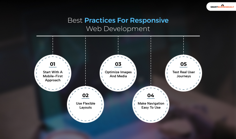
In this section, let’s look at the most effective practices for any kind of responsive web development:
1. Start With A Mobile-First Approach:
Begin by identifying the most important content and functions for smaller screens. Then progressively enhance the layout for larger displays.
This can help prevent desktop designs from becoming unnecessarily complicated when adapted to mobile.
2. Use Flexible Layouts:
Flexible grids and relative units allow elements to resize and reposition as the viewport changes.
Developers should avoid relying excessively on fixed dimensions that can cause content to overflow or become difficult to use on smaller screens.
3. Optimize Images And Media:
Images can account for a significant portion of a webpage’s transferred data.
Use responsive image techniques such as srcset and the picture element when appropriate. Modern image formats, compression, and lazy loading can also help reduce unnecessary downloads.
4. Make Navigation Easy To Use:
Mobile navigation should not force users to search for basic functions. Menus should be easy to open and close, links should be sufficiently spaced, and important actions should remain easy to find.
5. Test Real User Journeys:
Don’t test only whether the page “looks right.” Instead, test important actions such as searching, purchasing, submitting a form, navigating between pages, and contacting the business.
Check these journeys across relevant screen sizes and browsers.
How To Evaluate A Responsive Website?
Businesses can evaluate responsive performance by combining technical testing with real user data.
Useful areas to monitor include:
- Mobile and desktop conversion rates
- Page performance
- Core Web Vitals
- Form completion rates
- Navigation behavior
- Mobile engagement
- Accessibility issues
- Device-specific errors
Website analytics can also reveal whether users on particular devices experience higher abandonment rates or lower conversion rates.
These insights are more useful than assuming that a website works well simply because its layout changes on a smaller screen.
The Future Of Responsive Web Development:
Responsive development will continue to evolve as devices, interfaces, and user expectations change.
Modern websites increasingly need to account for more than screen width. Designers and developers may also need to consider different input methods, device capabilities, connection speeds, accessibility preferences, and user contexts.
Technologies such as progressive web apps, adaptive interfaces, and more personalized digital experiences can complement responsive development. However, these technologies do not replace the fundamentals of responsive design.
The priority remains the same: deliver content and functionality in a way that is usable, accessible, and appropriate for the user’s context.
Build Better Digital Experiences Across Devices:
Responsive web development is no longer simply about making a desktop website fit on a smartphone.
It is about creating a flexible digital experience that works across different devices while preserving usability, accessibility, performance, and essential functionality.
Moreover, a strong responsive strategy begins with the user’s needs. From there, businesses can use flexible layouts, optimized media, accessible components, and continuous testing to improve the experience across devices.
When these elements work together, a responsive website becomes more than a technical requirement. It becomes an important part of how users experience and interact with a brand online.




Related Articles



Comments Are Closed For This Article