


The Real Reason Some Office Screens Boost Productivity While Others Distract
27 May 2025
5 Mins Read

- Why Does Office Screen Productivity Differ? Let’s Know The Reasons
- 1. Not All Content Is Created Equal
- 2. Why Office Zones Matter More Than You Think
- 3. Size Does Matter! Decoding Office Screen Productivity
- Where Corporate Screens Tend To Miss The Mark
- When Tech Helps Teams Flow Better
- Motion, Memory, And Mental Load: Office Screen Productivity
- Better Screen Strategy Starts With These Questions
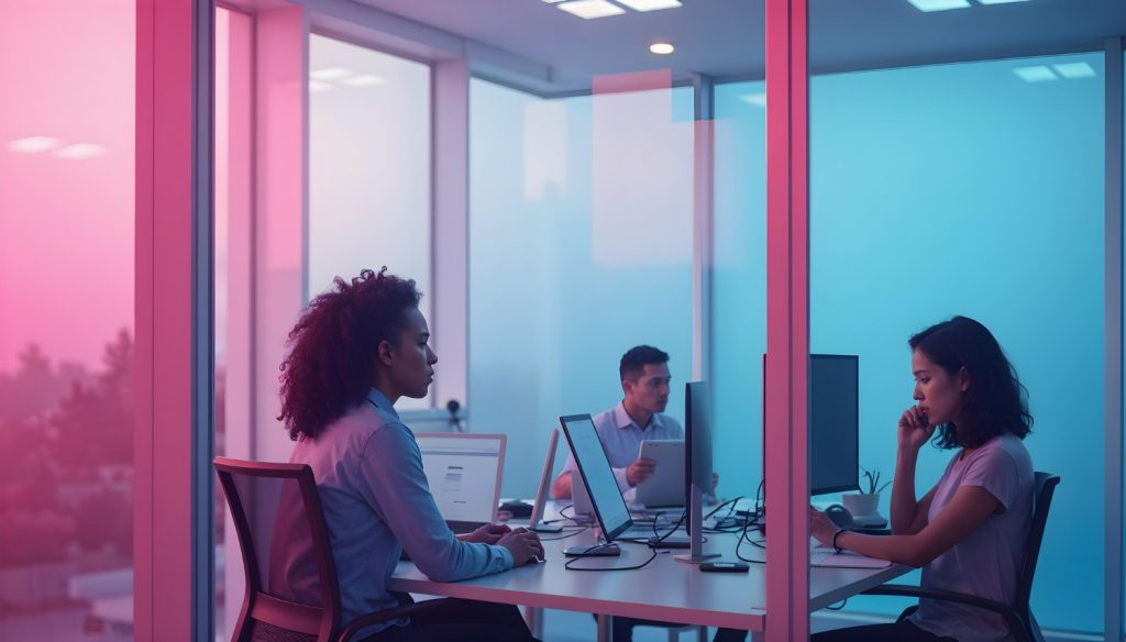
Screens in modern offices have shifted far beyond being tools for PowerPoint decks.
They now serve as focal points in meeting rooms, wayfinding guides in lobbies, and even subtle nudges in communal spaces to keep teams aligned.
Yet, for all the tech thrown into open floor plans, not every screen setup helps people focus. Some actually do the opposite.
The reason isn’t just in the screen’s resolution or the brightness of its colors. It’s in the decisions made before anyone mounts a display.
Placement, timing, motion, and message tone all shape how humans interact with digital visuals, especially in shared workspaces.
But why does office screen productivity differ? What are the factors behind office screens impacting the productivity of employees?
Let’s decode!
Why Does Office Screen Productivity Differ? Let’s Know The Reasons
Office screen productivity differs because of the content. Also, the positioning of the screen plays a huge role in understanding how it impacts the productivity of employees.
For example, I would prefer a screen with a work dashboard or other work-related matters near the conference room or meeting room.
However, in the lobbies or corridors, I would prefer a screen with a picture that calms the mind or has some motivating short messages. It will help us to get back to work even after the most disappointing meetings.
In other words, this screen will function as an impetus or a psychological boost.
Just exchange the placement of these two screens. The impact will be the reverse of what you expected.
1. Not All Content Is Created Equal
An overloaded digital screen doesn’t keep anyone informed. It wears down their attention.
Screens that constantly flash new metrics or rotate announcements too quickly train employees to ignore them.
There’s a point when visual noise turns background displays into office wallpaper, even if the data is technically useful.
The goal isn’t to bombard but to build a relationship between the user and the information.
People return to screens when the content has rhythm and relevance. This requires a strategy that goes deeper than uploading slide decks or calendar reminders.
2. Why Office Zones Matter More Than You Think
The same image on a wall in the breakroom feels different than one in a glass-walled boardroom.
Context influences how visual content is received. A well-placed productivity dashboard near a standing meeting zone can reinforce team momentum.
That same dashboard in a quiet focus nook becomes an interruption.
Screens should work with the behavioral patterns of each space. In transition zones like hallways or elevator lobbies, shorter messages make more sense.
In shared rooms, a visual anchor should hold attention long enough to deliver one or two key ideas, no more.
3. Size Does Matter! Decoding Office Screen Productivity
The display size of the screen is also an important factor in determining why office screen productivity differs.
Smaller screens are ideal when mobility is the priority, and you need to finish very specific tasks within a strict deadline.
However, when you have to work on a project that requires detailed graphics and has an extensive timeframe, you have to choose a bigger screen size with a brighter display.
Having said that, when you have a task that requires you to focus on a single document, you will choose a large and bright display.
Also, sometimes, you need to switch between various documents, and then you will need multiple screens.
Nevertheless, here, you must also remember that the choice of single or multiple monitors depends on individual preferences. You know what works the best for you!
Where Corporate Screens Tend To Miss The Mark
A screen that distracts or frustrates you usually has one of three issues: the wrong content, the wrong pace, or the wrong placement. It’s not always a design problem.
Often, the issue is that the messaging doesn’t understand how humans multitask, move, or mentally group information.
Here’s where things usually go sideways:
- Looping irrelevant metrics in spaces meant for collaboration
- Using motion-heavy transitions in already high-stimulation zones
- Displaying overly branded messages where people expect utility
- Overloading entry areas with information that could wait
- Forgetting to test if staff even look at the screens placed for them
A screen becomes useful when it fits into how the brain already wants to sort and act on information.
Otherwise, it ends up being one more piece of visual clutter that employees glance past without thinking.
When Tech Helps Teams Flow Better
When thoughtfully integrated, screens can reduce friction in a workday. In spaces where foot traffic flows or schedules shift fast, good digital signage keeps people oriented.
This is where corporate digital signage solutions actually pull their weight. They allow facility teams to adapt content in real time and even target content to a specific group or moment.
In those environments, display strategy blends with cognitive design. Screens feel less like tech and more like clarity.
Motion, Memory, And Mental Load: Office Screen Productivity
A screen in a workspace can either amplify mental load or relieve it. Fast transitions, aggressive animations, and overcomplicated charts compete with working memory.
For a knowledge worker trying to prep for a client meeting or wrap up a project, that’s friction they didn’t need.
The best displays create calm, not chaos. They support task flow by anticipating what the brain wants to know next, then delivering it in a clean, digestible format.
Better Screen Strategy Starts With These Questions
Before adding new displays to an office layout, decision-makers should ask a few questions that go beyond aesthetics or tech specs. The best screen investment is the one that actually changes behavior in a positive way.
Here’s what should guide the planning process:
- What do people need to know in this specific space?
- How long will they be looking at the screen?
- Will this information age quickly or stay relevant?
- Does the screen support movement through the space or slow it down?
- Can the content be adjusted quickly if routines or workflows shift?
Screens can improve productivity, but only if they respect the rhythms of human attention. A message is only effective if someone absorbs it. Otherwise, it’s just an expensive decoration.
Read Also:
- The Best Office Investments for a Thriving Business: Small Changes That Matter
- Office Desks and Their Impact on Employee Focus and Performance
- 6 Tips For Designing For Your Startup Office


Related Articles


Comments Are Closed For This Article