


What is Responsive Web Designing, And Why do You Need it?
5 Mins Read
Published on: 17 July 2023
Last Updated on: 02 April 2026
Responsive web design has transformed how websites adapt to different screen sizes and devices, providing users with an optimal viewing experience.
This article explores the concept of responsive web design, highlighting its significance in the modern online landscape.
It delves into user benefits, SEO impact, simplified website management, future-proofing, and the importance of collaborating with web design professionals.
Hence, stick around to learn why your website needs responsive web design so that you can effectively implement it in your web designing facts or planner.
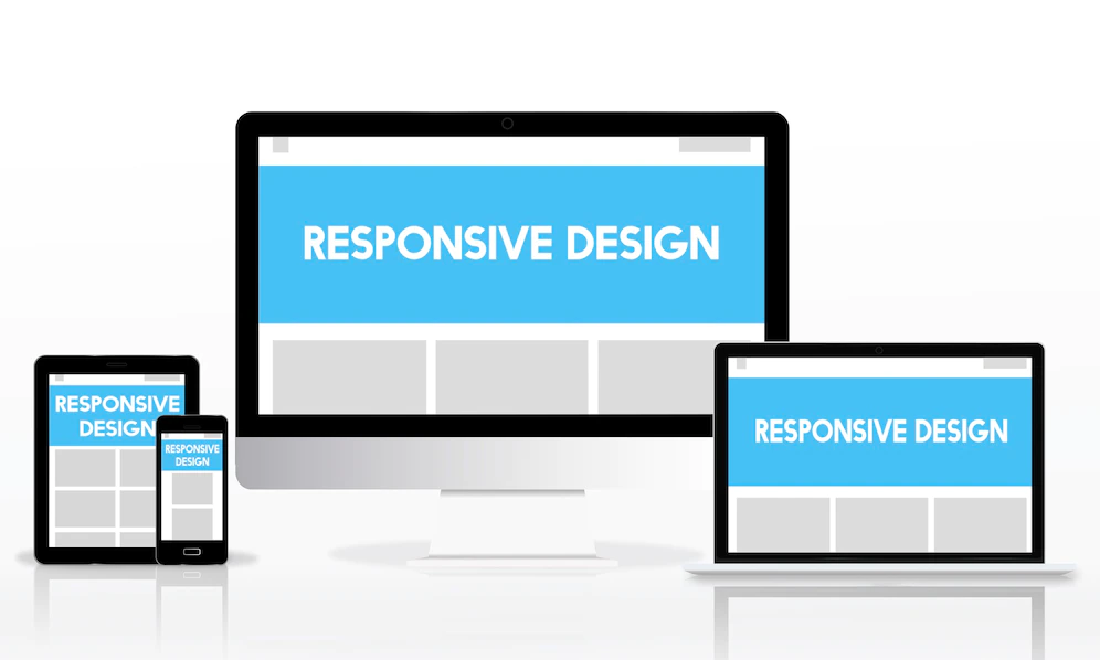
What Is A Responsive Web Design?

Responsive web design is one of the most critical and innovative means of web design. This form of web design revolutionized the field by adapting to the user’s device.
The primary goal behind RWD is to design websites that adapt to users’ needs and wants. Hence, this revolutionary web design form included users’ devices.
Therefore, it initiated a trend that changed the very landscape for good. Hence, this makes it a perfect step forward for web design.
Why do You Need it?
RWD, or responsive web design, has become essential in web design. This is primarily because, as more and more people become digitally savvy, their devices also improve.
As a result, people use many different devices to access the internet.
Hence, developers need to incorporate inclusivity into their website design so that more people can access it without hassle.
Primary Elements Of Responsive Web Designs:
Web design has truly evolved, and responsive web design has furthered this.
However, to truly understand this form of web design, you need to be clear about its primary components.
Here are some of the most prominent components of web design that you need to know to have a better understanding:
- CSS & HTML: CSS and HTML comprise the overall backbone of responsive web design. HTML dictates the structure, while CSS controls the layout.
- Media Queries: Media queries are one of the most fundamental concepts of CSS3, as they decide the resolution and screen size
- Speed: The final component. The website should be fast and responsive to function effectively.
The Significance of Mobile Devices:
The emergence of mobile devices, such as smartphones and tablets, has transformed how people access the internet.
Nowadays, users spend considerable time surfing the web on their mobile devices.
Therefore, websites must cater to this expanding user base.
Responsive web design addresses this need by allowing sites to adapt and provide an optimized experience on smaller screens.
It eliminates the frustration of zooming in and out or scrolling horizontally, creating a seamless and user-friendly experience for mobile users.
Benefits For Users:
Responsive web design offers several benefits to users, enhancing their overall browsing experience.
Responsive websites load faster because they are optimized for specific devices, reducing wait times and ensuring a smoother navigation experience.
Additionally, responsive design eliminates the need for users to switch between different versions of a website (e.g., mobile vs. desktop), providing a consistent and familiar interface across all devices.
This consistency enhances usability, as users can easily navigate and find what they’re looking for, regardless of their device.
Impact on SEO:
Search engine optimization (SEO) ensures that websites are discoverable and rank well in search engine results.
Responsive web design positively impacts SEO by providing a consistent user experience across all devices.
Search engines like Google favor responsive websites as they are easier to crawl and index.
Moreover, responsive design eliminates duplicate content across different website versions, preventing duplication issues and improving overall SEO performance.
Simplified Website Management:
Managing multiple website versions, such as a desktop and mobile, can be complex and time-consuming.
Responsive web design simplifies website management by consolidating all content into a single website.
Changes or updates need only be made once, and they will automatically reflect across all devices.
This streamlined approach saves businesses time and resources, allowing them to focus on creating valuable content and providing exceptional user experiences.
Future-Proofing Websites:
With continuous technological advancements and the proliferation of new devices, responsive web design offers a future-proof website solution.
Instead of creating separate websites for each new device, responsive design ensures that websites can adjust to any screen size or resolution.
This scalability makes websites more adaptable and resilient to technological changes, providing a solid foundation for long-term success in the ever-evolving digital landscape.
Collaborating With Web Design Professionals:
Implementing responsive web design requires technical expertise and an understanding of best practices.
Collaborating with web design professionals, such as agencies specializing in responsive design, can ensure that websites are crafted with precision and attention to detail.
These professionals possess the knowledge and experience to create visually appealing, functionally efficient websites that adapt seamlessly across all devices, enhancing user experience and driving business success.
Is It Right For You?
In today’s digital landscape, websites must deliver exceptional user experiences across various devices.
Responsive design has become necessary with the increasing use of smartphones, tablets, and other mobile devices.
Responsive design eliminates the limitations of fixed dimensions and allows websites to adapt seamlessly to different screen sizes and resolutions.
Whether a user is accessing the website on a desktop computer, smartphone, or tablet, responsive design ensures the site is optimized for their specific device.
This enhances the user experience by providing consistent, intuitive navigation, readable content, and visually appealing design.
By partnering with web design professionals, businesses can leverage their expertise in responsive design to create websites optimized for all screens.
These professionals deeply understand the latest web design trends, technologies, and best practices.
They can ensure that the website not only looks great on different devices. They also perform optimally, providing fast load times and smooth interactions.
In summary, embracing responsive design and partnering with web design professionals enables businesses to optimize their websites.
Responsive web design empowers businesses to connect with their audiences effectively and provide an engaging online presence.
By delivering exceptional user experiences across devices, businesses can gain a competitive edge, increase user engagement, and drive conversions in today’s digital landscape.
Read Also:
- Top 20 Healthcare Web Designs In 2022
- Practical Tips To Redesign Your Website On A Budget
- Attracting New Patients: The Role of Effective Dental Website Design


Related Articles


Comments Are Closed For This Article