


Successfully Advertise With Billboards In The Country’s Second Largest State
4 Mins Read
Published on: 16 July 2022
Last Updated on: 13 November 2024

Dipping your toes into the world of out-of-house marketing can be intimidating at first, but you don’t have to worry about the success of your marketing campaigns if you keep a few important things in mind.
While it’s key to make your Texas billboards—and even other marketing materials—highly visible, that’s not the only valuable piece of information.
What are a few of the best ways to draw positive attention to your Texas billboards? What kinds of fonts should you use?
How should you be phrasing your copy for your different Texas billboards? And how many pictures are you going to be able to effectively include? If you want these questions answered, you’ve come to the right place.
Top 5 Ways To Hone In On To Advertise With Billboards Successfully
Overview:
- Play With the Billboard’s Surroundings
- Only Use Large Fonts
- Only Use the Words and Phrases You Need
- Limit It to Just One Picture
- Utilize Fonts That are Easy to Read
1. Play With the Billboard’s Surroundings
Not every billboard location is going to be perfect, and Texas billboards are certainly no exception to this rule.
While you might know a few basic things about billboard placement, like aiming for the right side of the road and avoiding spaces that have been blocked out by large buildings, there is another factor that you can keep in mind while you’re crafting.
If you ever see an interesting place for your Texas billboards to go, it might be worth the risk. Turn power lines into mustaches for your company’s mascots. Make references to main attractions in the surrounding areas in your copy.
And if billboards have some strange shapes, play with the new corners or edges to show your company has a sense of humor.
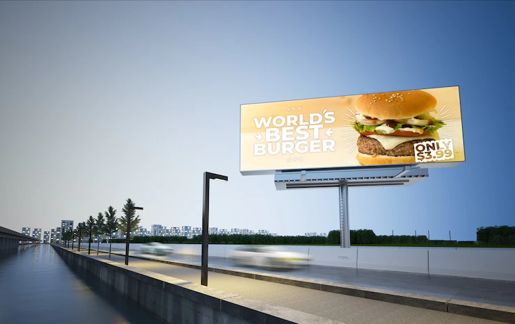
2. Only Use Large Fonts
Obviously, larger fonts are going to be significantly easier for your potential clients or customers to read. But why does that matter? The further away drivers are from your billboard, the harder time they’re going to have while attempting to read your text.
Additionally, your potential clientele is only going to have a very limited amount of time in order to read everything that you’ve written.

Even if they’re actively trying to read your billboard, the number of seconds you have are very few. And what’s worse? Most potential customers are trying to let your ads stay in their peripheral view.
So don’t make it any harder than absolutely necessary to read your copy. It’s already difficult enough to get or keep their attention.
3. Only Use the Words and Phrases You Need
Try to make sure you’re only including all of the copy you absolutely must. On billboards, you have extremely limited space, so say what you need to say in as few words and characters as possible. What is this going to look like for you?

Mention your service type, your business name, what makes you stand out, and a call to action. Your call to action can tell your potential customers or clients to pay a visit to your website, give your offices a call, or buy a particular product or service.
And, as mentioned previously, this works well if you’re trying to keep your font size as large as possible. Giving your potential customers less copy to absorb, as well as making the font as big as you are able, is really going to help your message stick.
4. Limit It to Just One Picture
All billboards, including Texas billboards, have extremely limited space. In case it wasn’t obvious, most of the tips in this post are about maximizing the use of the limited space you have available to you.
That means it’s pretty important to get your key ideas across without being overwhelming, as well as making the information easy to consume quickly.
By using just one large picture, in addition to the large and concise copy, you’re adding to your Texas billboards, you’re making it easy for potential clients to walk (or drive) away with a clear message.
So do your best to use as few images as possible. Whether your image is a drawing or a photograph, make it so there’s nothing distracting in the background and there are no extraneous lines.
For example, while you’re taking your pictures, make sure you have a clear background or that you have the means to edit out any distractions.
And if you’re going to draw something or utilize other graphics, make sure the image isn’t too complicated. Consider only including key characters and items they can hold or otherwise immediately interact with.
5. Utilize Fonts That are Easy to Read
What makes a font easy to read? As previously established, larger font size is going to make it easier for passersby to digest your content quickly than a smaller-sized font. But what kind of font should you pick to print?
It’s highly suggested that you aim for a font style that is non-serifed, as serifs can accidentally result in your copy being misread, misremembered, or not read at all. Non-serif font styles allow readers to walk away with the copy written in the clearest and cleanest way possible.
Additionally, it’s best to use font styles that appear to be regular letters. Using shapes in place of letters, including emoticons, can potentially also result in your copy being misunderstood.
While a star shape may read as the letter “a” to some, it may read as the letter “o” to others. The star may also just be seen as a star, turning the word into a confusing mess for readers.
Additionals:
- 5 Types Of Advertising
- 10 Things You Wish You Knew Before Starting a Business
- 5 Actionable Ideas To Fine-Tune Your Marketing Strategy
- Brands Investing in Performance Marketing Reap Better Benefits and Returns


Comments Are Closed For This Article